Navigation is the backbone of all software, website and app designs. It holds your product together and allows your users to get to where they need to go and do what they need to do.
When done correctly, it’s an imperceptible aspect of design that no one will think about or comment on. When done incorrectly, it will cause users to curse and rant and declare outrage at the powers that be. Check our list of do’s and don’ts for a navigation that users will delightfully ignore. As the saying goes: “the best design is invisible”.
Do’s
Visibility and familiarity:

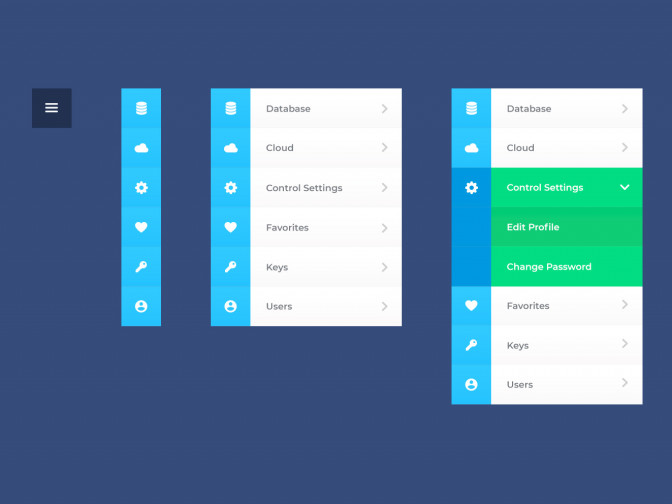
Use conventional layouts to ensure that users can navigate properly. This includes putting a hamburger menu in the top corners of mobile website, using a sticky footer navigation in mobile, or using tabs for your main categories in the header of your desktop website.
Hiding navigational elements until a user swipes or taps is ill-advised, as people may never find it. This trend may provide a “cleaner” layout, but certainly not a clearer one.
Obviously interactive:

This means that all clickable elements should be evidently clickable. Make your interactive elements look different from all other elements (text links should have a different colour or an underline, icons that are clickable should appear to be so, etc.).
Shows location:

Your navigation should always be able to tell users, in a glance, exactly where they are. This means that the current location should always be highlighted or indicated at the top of the page. A good test for this is to imagine that a user has deep-linked to this page and has arrived here without going through your navigation. Can they still understand where they are?
Consistency:

Make sure that the same elements always appear in the same place. If you have a page title with a breadcrumb underneath in one section of your website, make sure you apply the same format to all other pages.
Meaningful labelling:

Navigation is one of the most important parts processed by Google Snippet. Meaningful labels are a great way to improve your SEO.
Don’ts
Categorise content in unexpected locations:

To avoid this, make sure that groupings of content are intuitive to users, and that the groupings use familiar vocabulary.
Competing links/categories:

This occurs when you have categories that are similar but different. An example might be having a section called “instructions” and another called “rules”. Although they most likely refer to two completely different things, users might not grasp the distinction and get lost/frustrated.
Islands of information:

This is when you have a piece of content that do not fit with anything else on your page. Although this can be done to promote content, it can create confusion or blindness in users (as they learn to ignore sections that are not relevant to them). Better is to create a relationship between all the content on the page.
Repetitive links:

Although well-intended to give multiple paths to the same content, it’s usually a bad idea. If you have a section called “rules” in the sub-header, for example, it would be unwise to repeat this exact link in the left nav. People will often wonder if there is a difference between the two (maybe one is general and one is specific for this page?). As soon as you have people thinking about the navigation instead of your content, you’ve lost the battle.
Stranding users on microsites:

Avoid doing this if possible. If it’s unavoidable, please give your users a way back to your main website.
About the author
Tasha is our Lead UX Designer. She enjoys the challenge of taking complex functionalities and translating them into simple user interfaces. Her years of experience have made her an expert at recognizing usability issues, collaboratively finding solutions, and creating products that people love.