Design handoff stage is an integral part of any project. This moment comes when UI (specs and assets) is to be handed over to the developers. Name it how you want it: slicing, engineering handoff, design handoff, developer handoff, design-to-dev or simply design-to-code. How many times have you seen designers complaining about front-end teams not following their work, and the engineers complain about the designers having unrealistic ideas? This issue of balance is common among many teams.
Speaking same language
Common issues generated by a poor design handoff among others are:
- Unnecessary, multiple back-and-forths between designers and developers;
- Unexpected quality assurance issues, or QA issues that are more time-consuming than anticipated;
- Inconsistencies in the delivered product or plainly saying — ugly UI;
- Sacrificing features that might have been introduced into a product, decreasing the quality of users’ experience;
- In the end, lengthening the product development process, and draining the budget.
Communication breakdowns can result in all kinds of misunderstandings — even in different interpretations of the same goals, which can lead to confusing or downright bad UX.
Apart from good communication, an understanding of how the pixels on the UI design are turned into the code, helps to spot issues in advance, re-evaluate and create a pre-emptive design trade-off, that solves same problem but through easily implementable solution.
Understanding how the code is built, in what sequence, with which tools, how it grows, how it becomes integrated within other lines of code into a functioning product, makes designers more effective and extend their capabilities.
But there is so much more than that. Among the responsiveness, cross-device platforms, animations behaviour, structuring the code layers, there are also such things like device performance or battery drainage. The awareness of how digital products are supported, what extensions they might need, and whether they might slow down certain devices or even cause a crash, is also vital to deliver best experience.
The truth is designers doesn’t have to become developers, but mastering these skills and widening the spectrum of ‘dev’ insight is a decisive capability in the race — who can faster deliver better experience to the users — towards winning.
How to avoid duct-taping in the development phase? Two words: Design System.
There are many ways of translating UI design neat pixels into code poetry. That’s why this kind of problem requires a systematisation. This approach ensures that most of the routine questions regarding UI implementation may be answered pre-emptively without unnecessary back-and-forths.
Introducing a design system will ensure that each team member is focused on their tasks instead of spending time to find the necessary specs, therefore reducing the overall back-and-forths within the implementation process.
As designers are the architects, they have to be able to materialise user experience within the ‘Notre Dame’ they have designed. Thus, giving developers specific, all-case-scenarios guidelines, they clear the path that will take devs up for success.
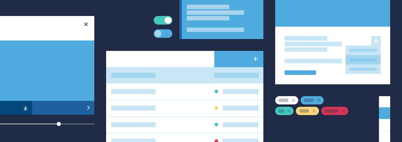
Yet, the truth is that a design is never done. Therefore, do not lose hope, when developers start poking around and finally ask about one unforeseen case scenario; it only means the collaborative systematisation is working. Because well-drafted design system already answered a bunch of questions that didn’t need to be asked at all. Design system is a living and always-growing organism; not everyone can have it coast-to-coast from the beginning. In such cases, we recommend to start crafting a UI components library as the first step towards building a complete design system. You can even make a few shortcuts if you do your UI library based on an existing front-end framework.
Once the design system will be well thought-out and respected, the development phase should be swift, effective and duct-tape free.
Collaboration is the major player
It is extremely important that communication between developers and designers is done the right way. This doesn’t necessary mean that there should be a meeting at the start of each design task. Generally, there is no ‘one size fits all’ approach for design-dev collaboration.
The most sensible approach is to ensure clarity and manage expectations during every step of the process. Hence, it’s important to pinpoint in advance any potentially code-wise troublesome UI elements, so designers can, from the start, think how to meet technical requirement within their design. Additionally, by sharing the understanding of the code and the knowledge with designers. Finally, by making it easier for developers to consume all design information, making prototypes easily inspectable, ensuring readability or maintainability of the UI design.
Thus, a shared vision communication, consistency and education should be high-priority and should result in smoother collaboration and a better experience for the end-user.
Reducing the knowledge gap
Knowing all that, how to achieve the dev-design equilibrium?
Platform design principles
Designing without understanding design principles is like playing a game without following its rules. Respective design guidelines, whether they are HTML/CSS, iOS, Android, VR, PWA, have all been elaborated to keep consistency and clarity within a specific interface.

There are many examples of some common rules that should be followed, for example:
- Tab- and top-bar in Apple’s iOS may not be casually changed;
- Touch targets spacing should be well thought-out to ensure enough space for users’ finger tap, according to Android’s Material Design guidelines;
- Tappable areas in PWA should give tactile feedback, so user shouldn’t be left wondering if the tap has been recognized:
- Safari users cannot take advantage of Google’s .webp super compressed images, so we need to deliver them the .png/.jpeg fallback.
- Being aware of such guidelines is often crucial for delivering intuitive experience that user deserves.
Getting the lowdown on the key pieces of front-end frameworks
There is a wide spectrum of HTML/CSS/JS front-end frameworks available for developers to build products. Using such frameworks saves a lot of human effort, as well as helping to keep it lean and clean by using and reusing existing components. If a decision is reached that development will be made upon Bootstrap, Foundation, Material, Bulma, Semantic, Fluent or any other, before rushing into a project the designer should spend time playing with the framework and getting the lowdown on the key pieces of its architecture and components. This will help avoid bloating the design system as well as developers’ stylesheets and deliver a better product faster.
Provide specs with labelling and detailed annotations
Using and following design system (UI-Kit) is obvious but sometimes using dev-understandable names for downloadable assets can be equally helpful for developers. There are many rules in front-end HTML, CSS, Javascript. Among them is one that designers should be familiar with — naming conventions. As Phil Karlton once said: «There are only two hard problems in Computer Science: cache invalidation and naming things». Using a unified and easily understandable naming convention throughout design deliverables might save hours of developer work.
Edge cases and empty states design
It is somehow good when certain behaviour, label or input breaks the design. For this, edge cases and empty states, come in handy. Edge cases include, inter alia, putting the long German word [e.g. Waldeinsamkiet in Neuschwanstein] into a label and seeing how it breaks. Answering to the question, what will happen when nothing is to be displayed, will help simplifying things for developers. Atypical use-cases and empty states should be considered while creating a design and often this approach will affect the design even before the handoff. Yet, it should be noted that such stress tests of the design should be used reasonably and with moderation. Certainly, it does not make sense to change the design for the sake of one extraordinary user case in 10 million regular cases.
Mind the containers
The front-end layout building has its own rules, especially for certain CSS properties and values, like: display, flex, grid, float, position, overflow, z-index.
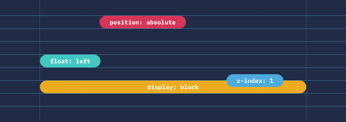
Comprehending what each CSS property (and value) does to the pixels on the screen, gives an amazing insight into how the particular component is constructed and neatly placed on the screen. Same thing with native iOS and Android apps, where, for example, the positioning, alignment, and spacing of content is aided through Safe Area or ViewGroups.
Take device performance into account
It is reasonable to expect that designers first understand the possibilities and restraints of the technology they are working with, and only then delve into the creative design. For example, if an app or website will need additional time to load an API or certain assets on slower devices, affected users should be aware of that or saved from crashing, or not left wondering whether something went wrong.
Animations and micro-interactions
Since most of the designing tools lack proper extraction of the animations to .json or transformation to CSS/SVG, developers have to rely on a well-written specs detailing each interaction.
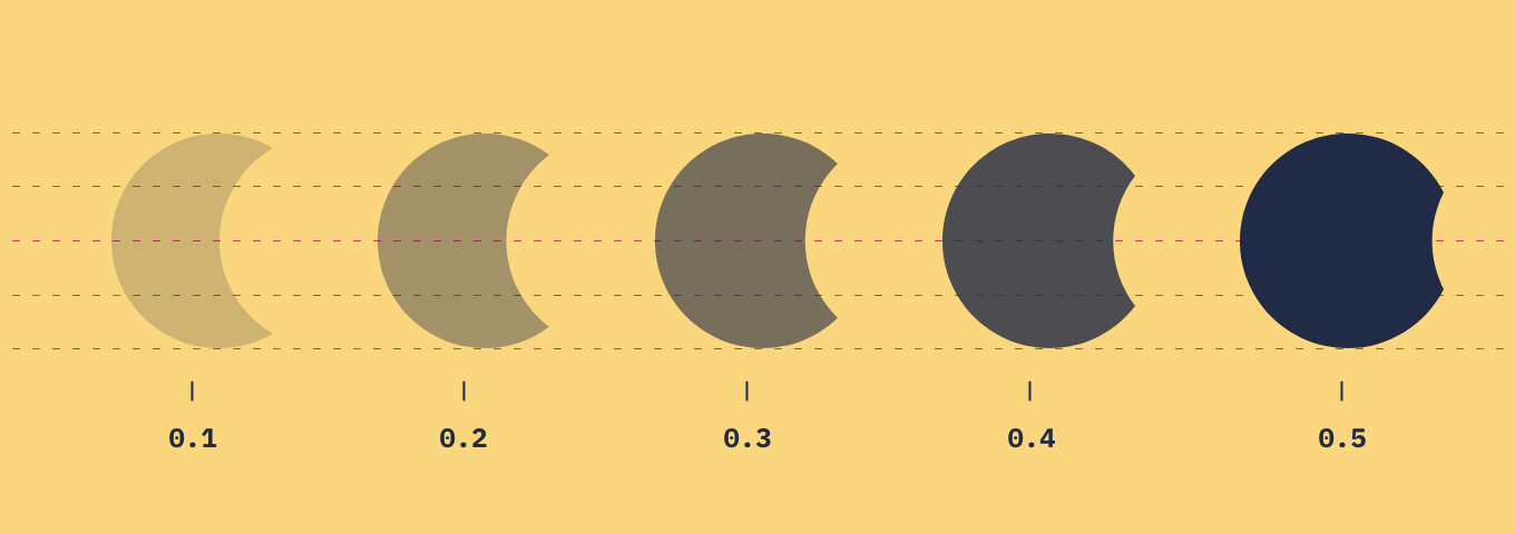
Knowing how the actual animation is done in front-end, makes designers understand all the little, almost invisible things that happen under the screen.
To frame my train of thought, UI designers should be able to introduce a comprehensive, end-to-end design that is easily transformable to code, through a continuous and integrated handoff process. Designers won’t become developers but, can grow into a well-organised expert, doing less grunt work, decreasing numbers of iterations, less pixel-pushing as well as contributing to eliminating back-and-fourths on email or through internal communication with engineers and in the end, to have more time to be creative.
Main takeaways
- Support deeper developer-design communication and collaboration.
- Encourage developers to share with UI designers the coding knowledge as well as project information on early stages of the projects.
- Enhance collaboration with help of design systems, guidelines, libraries easy to be followed and respected by developers.
